
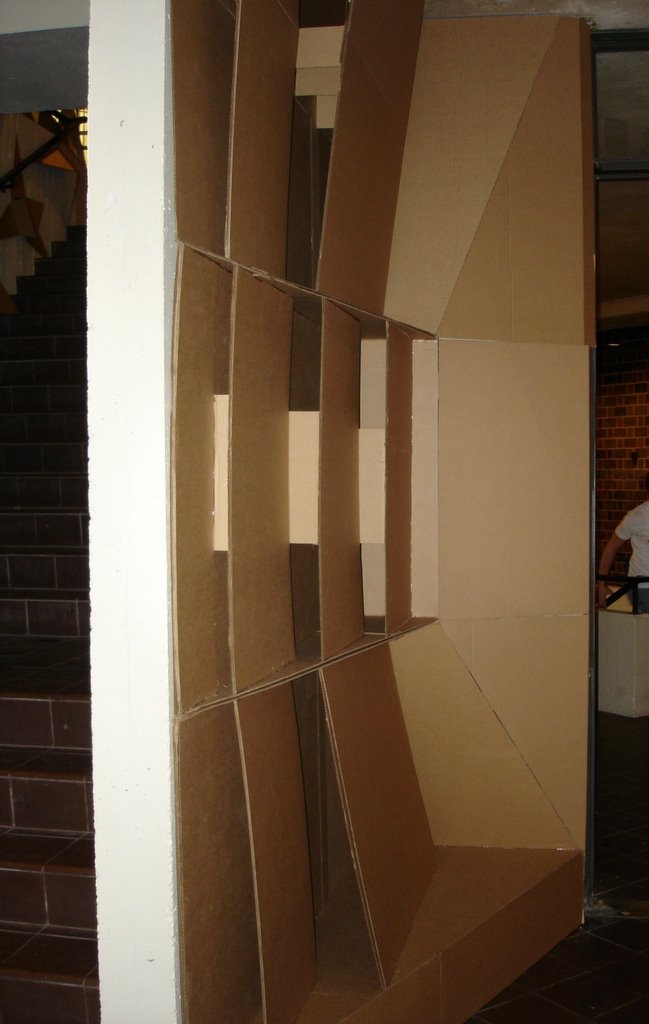
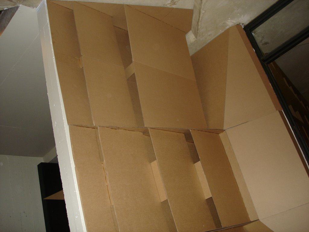
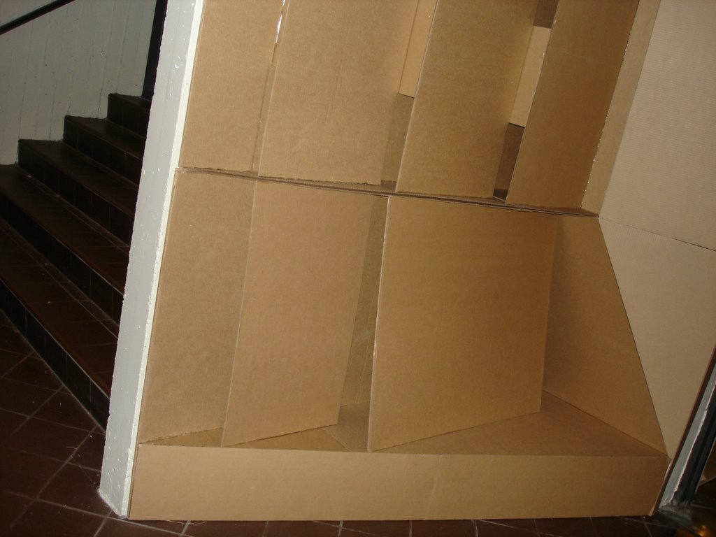

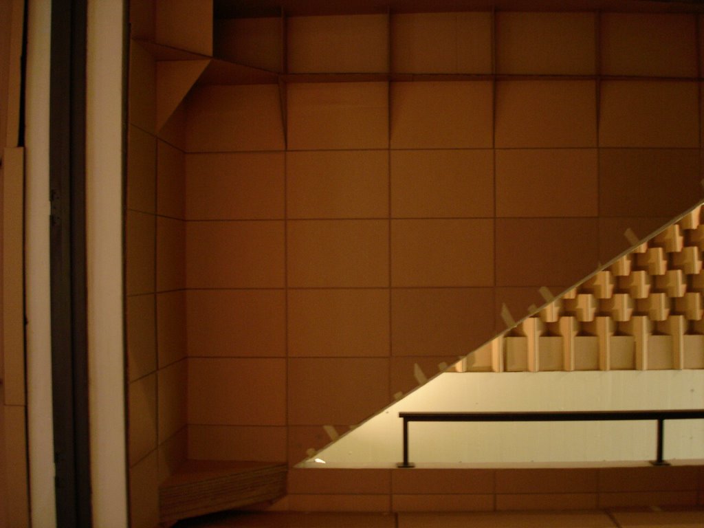

[Which one do y'all think is better? Ahhh... obviously the doorway divider in the middle is the separation between left and right? Excuse the tape that was before the actual presentation... (safety measure) it holds without the tape... pictures of that later... along with Demolition!!! Hehheh... I don't think I ever fully explained the concept... well it goes something like this... the concept for the installation was to create a space that would invoke discussion and attract attention, from the Architecture Students that mindlessly walk past this area everyday. The panels are created with a 12" X 18" rectangle in mind (ex: on the right side the rectangles are 12" X 18" for one sheet each time, the change in dimensions on the left side is for pinning bigger sheets of paper;
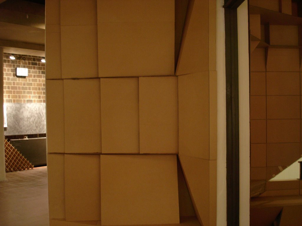
middle section is 36" X 18" for pinning up 3 11" X 17" Vellum sheets on top of one another; also on the left side there's a 36" X 9" for pinning up 3 8.5" X 11" sheets vertically and there's a space for a 12" X 12" side of the right side for pinning up the same side. The shelves on the right side are for putting 3 dimensional objects (ie: models) the "bench" was not fully completed but handles models with ease... just not so much people... that's all because it wasn't fully completed... ran out of materials... anyways back to the concept. Yeah, I think that's pretty much it... hehheh... oh yeah, the concept was meant to remain within the boundaries of the pre-existing walls, the site receives a heavy amount of traffic, so I wanted to stay within it's borders. The jurors like the left side... from that side view it does really does grab your attention... the right side... not so much... that's what their feeling was. The dynamic shelving on top is kinda too dark and too far away... I can see where they were coming from. The point was make that from the staircase that that one close to the floor shot... yeah you don't really get grabbed into the piece at that point... and that's what they didn't like about it. I think all areas got it though.]
But yeah, that project is knocked out. Bring on the next semester! Man... I wish the rest of these other classes in this semester were over... back to work. Here are some before pictures as I'm leaving...


No comments:
Post a Comment